So, I decided to create a “business card” from one of my pictures. I don’t really need a business card in the traditional sense, but it would be good to have something to hand out. I never seem to have a pen when I want to tell someone about my site. I really should put my flickr address on there too. Maybe on the back.

I’ve had some comments about the picture and the font. The font seems inconsistant and leaves some pretty big spaces between some of the letters. I don’t have kerning on elements, which is unfortunate. Not sure if would fix this font. Might need to try another.
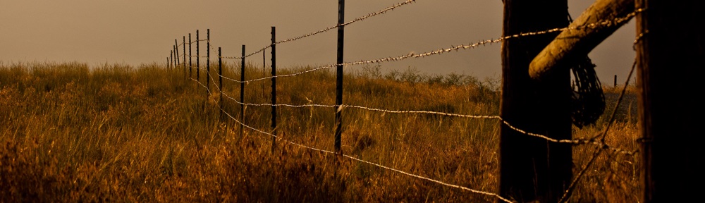
I kind of like this picture, but others have said that it makes them think of a florist, or that it is not a striking photo, or some such thing. What do you think?
I think I would choose a different font. Maybe try lower case for the e-mail and web address and don’t leave as big of a gap between them. I think having them together draws your eye to them.
I think the green seems to dominate and over power…not sure how to change that impression. I know you like flowers do you have a picture with a flower and some other object to balance?
Where are you going to print them?
Same comments as others I have shown them to. The two lower lines were closer together, but the space in the middle get too big.
I guess the font doesn’t work, unless elements could change the kerning on the font. There are some issues there.
I like the green, and the image, though others thought the image was only so-so. I can’t really put something else there that “balances”, there would be no room for text. Most cards just have an image to one side I think.
Printing is definitely up in the air. Maybe no one does cards in full color. Not sure.